
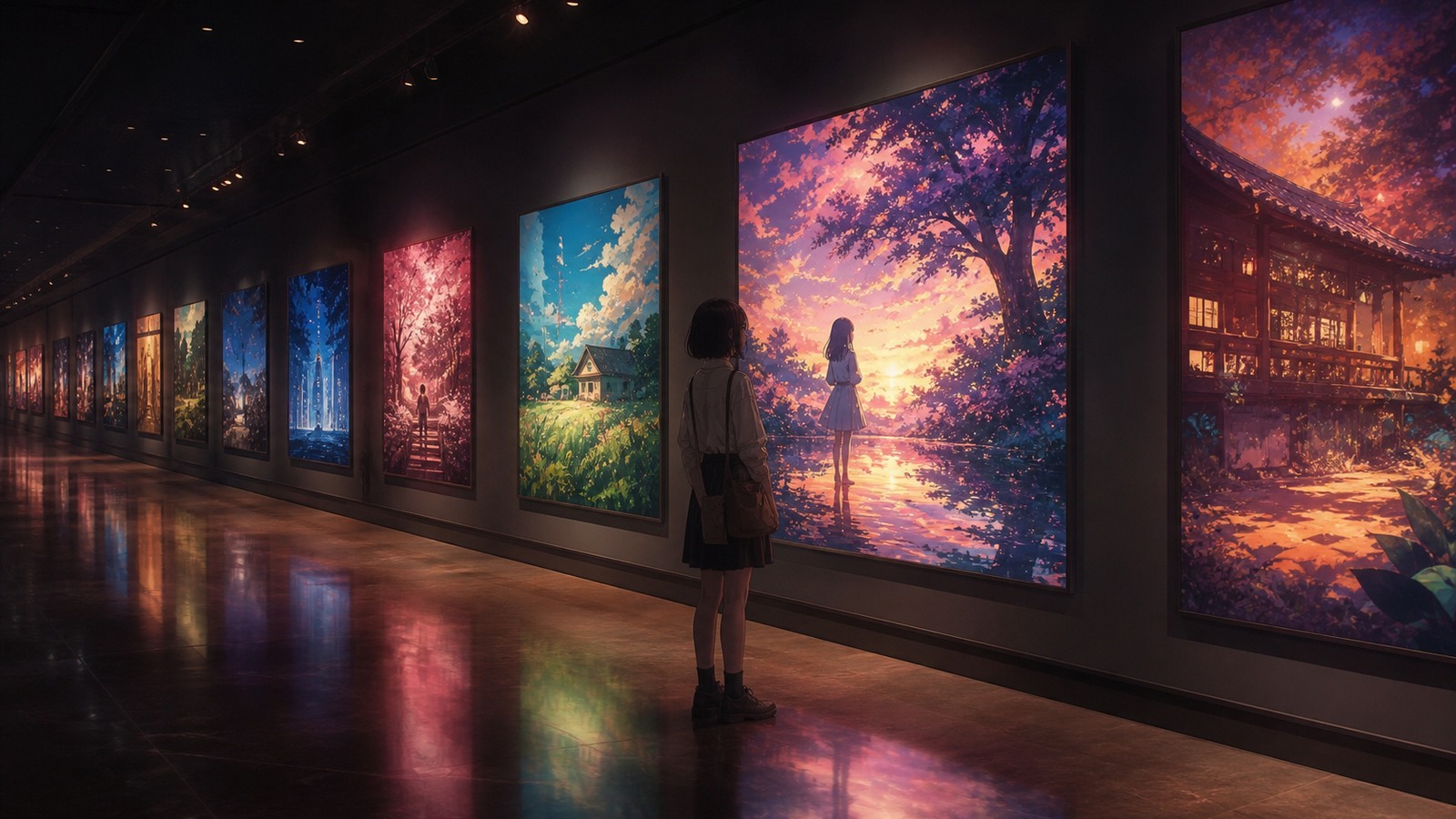
Anime Art Styles That Stay In Your Head
The most memorable anime art styles are not memorable just because they look polished. They stay with fans because the visual choices are specific enough to recognize: the softness of a Studio Ghibli forest, the hard neon pressure of Akira’s Neo-Tokyo, the fashion-pose drama of JoJo’s Bizarre Adventure, or the painted rush of Demon Slayer’s breathing forms. A strong style gives a viewer something to notice before the plot is even explained, then keeps deepening that first impression through color, line, movement, backgrounds, effects, and character design.
Sources and Further Reading
These references are useful for checking studio credits, release context, staff information, and current anime industry reporting.
A: Look for clear tone, memorable characters, strong scene craft, and a reason the story sticks.
A: No. Popularity shows reach, but quality depends on execution and viewer fit.
A: The biggest mistake is confusing pretty screenshots with strong storytelling.
A: Sometimes, but accessible pacing and personal taste matter more.
A: Yes, when visuals carry mood, theme, character, or worldbuilding.
A: Compare what each show is trying to do, not only which is bigger.
A: No. They are valuable when they fit a viewer better than obvious picks.
A: Setup, character pressure, direction, music, and consequence.
A: It is best for fans who choose anime by mood and look.
A: Mix trusted favorites with one unfamiliar title that expands your taste.
What Makes An Anime Art Style Memorable?
An anime art style becomes memorable when its visual rules repeat clearly enough that fans can recognize the work from a single frame. That might mean a certain kind of character silhouette, a color palette, a background texture, a way of staging action, or a habit of turning emotion into motion. The key is consistency with purpose. A show can be detailed, loose, cute, grotesque, minimal, or explosive; what matters is whether the look helps the story feel more like itself.
That is why art style is different from animation quality. Animation quality often describes how movement is executed, while art style describes the broader visual language. Akira is remembered for fluid motion, but also for its dense city design and body-horror imagery. JoJo’s Bizarre Adventure can be remembered even in still images because its poses, costumes, anatomy, and color choices are so theatrical. Mob Psycho 100 often looks deliberately rough, but that looseness is part of its emotional force.
Studio Ghibli And The Warmth Of Lived-In Fantasy
Studio Ghibli is one of the easiest entry points for understanding anime style because its most famous worlds feel tactile. In My Neighbor Totoro, rounded creatures, rural paths, soft interiors, and natural weather make fantasy feel close to ordinary childhood. In Princess Mononoke, forests, masks, animals, weapons, and wounds carry a darker ecological weight. In Spirited Away, the bathhouse is crowded with food, steam, labor, spirits, grime, and small gestures that make the supernatural setting feel inhabited rather than decorative.
The useful lesson is that Ghibli’s visual memory often comes from environment as much as character. The backgrounds do not sit behind the story as wallpaper; they create the emotional temperature of the scene. A grassy field, a forest path, a kitchen, a boiler room, or a bathhouse corridor can tell the viewer how the world breathes. That organic softness is very different from the industrial pressure of Akira or the graphic distortion of Panty & Stocking.
It is also worth being careful with the phrase “Ghibli style.” Studio Ghibli’s catalog includes different directors and different visual priorities. Hayao Miyazaki’s fantasy naturalism is not the whole studio by itself. For this topic, the strongest Ghibli examples are useful because they show how shape, setting, and atmosphere can make fantasy feel emotionally real.
Akira And The Weight Of Neo-Tokyo
Akira remains one of anime’s clearest examples of a visual identity built from pressure. Neo-Tokyo is not merely a backdrop for Kaneda, Tetsuo, motorcycles, soldiers, labs, and psychic catastrophe. The city is part of the sensation: roads slice through darkness, lights smear across movement, machinery fills the frame, and architecture makes the characters feel small inside a system already close to collapse.
The film’s style is memorable because it makes density feel physical. Mechanical detail, smoke, rubble, military equipment, urban scale, and body-horror transformation all push in the same direction. When Tetsuo’s body becomes unstable, the imagery does not feel separate from the city around him; the same fascination with material stress is everywhere. Compared with Ghibli’s organic worlds, Akira feels metallic, crowded, hot, and dangerous.
For fans learning to describe art style, Akira is a strong reminder that “dark” is too vague. The more useful words are industrial, urban, anatomical, cinematic, crowded, and kinetic. Those terms point to what the viewer can actually see.
JoJo’s Bizarre Adventure And Style As Pose, Fashion, And Attitude
JoJo’s Bizarre Adventure is memorable because it treats visual flamboyance as a core part of identity. Hirohiko Araki’s long-running manga gives the anime a design language full of sculptural poses, bold silhouettes, dramatic anatomy, patterned outfits, and sudden color choices. Characters do not simply stand in a scene; they announce themselves through posture and shape.
That visual attitude matters because JoJo spans generations and parts. The style cannot be reduced to one fixed look, but the franchise keeps returning to a sense of theatrical display. Stands, villains, heroes, fashion references, and dramatic panel-like compositions all make the world feel heightened. Even when the story moves from one era to another, the viewer is trained to expect bodies and colors to behave with unusual confidence.
JoJo is especially useful when comparing manga-origin style to studio-origin style. The anime adapts a visual personality that already had decades of identity behind it. That makes it different from a series like Demon Slayer, where the modern anime image is strongly associated with effects, compositing, and action presentation.
Madoka Magica And The Power Of Visual Contrast
Puella Magi Madoka Magica is a great example of a style becoming memorable through collision. The main character designs are soft, rounded, and tied to magical-girl expectations, while the witch spaces push into collage, cutout textures, symbolic shapes, and hostile abstraction. The contrast is the point. The viewer is invited into something cute, then forced to confront an environment that feels broken, theatrical, and psychologically unsafe.
The production credits support that split. The franchise’s official staff materials identify aokiume with the original character concepts, Shaft with animation production, and Gekidan Inucurry with parallel world design. That combination helps explain why the show does not look like a simple dark magical-girl story. Its style creates emotional whiplash by putting incompatible visual languages in the same work.
For readers, Madoka Magica is useful because it shows that a memorable art style does not have to be uniform. Sometimes the strongest identity comes from deliberate friction: soft characters against sharp spaces, innocence against threat, familiar genre imagery against surreal design.
Demon Slayer And Modern Effects-Driven Action
Demon Slayer: Kimetsu no Yaiba is one of the clearest modern examples of action style shaped by compositing and effects. Tanjiro’s water forms, fiery attacks, glowing color accents, night battles, and fast camera movement all give the anime a visual signature that fans can recognize quickly. The sword forms often feel like painted motion passing through a digitally polished image.
The look is not created by a single ingredient. The official anime staff list credits ufotable for animation production and includes roles for character design, concept art, color design, photography direction, and 3D direction. That matters because the final image depends on how drawings, backgrounds, color, digital effects, and camera movement are combined. When fans remember Demon Slayer’s action, they are often remembering that whole pipeline at once.
The important distinction is that effects can be stylized combat language rather than a simple literal object in the scene. The point for visual analysis is not only whether water or fire is physically present. The point is how the image communicates rhythm, technique, danger, and beauty in a way that belongs unmistakably to the series.
Violet Evergarden And The Drama Of Polish
Violet Evergarden is memorable for a different reason: restraint. Kyoto Animation’s 2018 series builds much of its visual identity from light, hands, hair, fabric, letters, gloves, typewriters, and quiet facial acting. Instead of overwhelming the viewer with constant spectacle, it turns small movements and polished surfaces into emotional signals.
That makes it a useful counterpoint to Demon Slayer and Akira. Violet Evergarden’s style is not remembered because everything explodes outward. It is remembered because grief, longing, and tenderness are often placed inside tiny visual details. A hand hovering over a letter, light moving across a room, or Violet’s controlled posture can carry as much weight as a larger action sequence.
For newer fans, this is an important lesson: visual memorability is not the same as visual volume. A restrained art style can be just as recognizable when the production gives the viewer precise things to watch.
Mob Psycho 100 And Expressive Imperfection
Mob Psycho 100 proves that looseness can be a strength. Its simple faces, elastic bodies, rough line energy, and sudden bursts of abstraction match a story about emotion pressing against control. Shigeo “Mob” Kageyama’s psychic power is not only a plot device; it is a visual permission slip for the anime to bend, smear, flatten, and explode its drawings when feeling becomes too intense.
That is why the show works so well as an art-style example. It challenges the assumption that great anime style must always mean refined detail. Mob Psycho 100 can look sketchy, painterly, childish, chaotic, or explosive depending on the emotional beat. The changes do not weaken its identity. They are the identity.
Placed beside Violet Evergarden, the contrast is especially clear. One uses polish to make feeling legible; the other uses distortion. Both approaches can be memorable because both are tied to the inner life of the characters.
Panty & Stocking And Anime That Refuses To Look Typical
Panty & Stocking with Garterbelt belongs in this discussion because it pushes against what many viewers expect anime to look like. Its flat graphic bodies, thick outlines, simplified faces, rubbery motion, bright color blocks, and crude comic energy bring it closer to adult Western cartoons than to standard anime prettiness. That difference is not a flaw; it is the visual hook.
The series is useful because it shows how memorable style can come from rejection. Instead of asking the viewer to admire delicate detail or naturalistic beauty, it goes for speed, attitude, contrast, and shock. The look makes the comedy louder and the transformations more surprising because the show is always ready to snap between graphic simplicity and heightened anime impact.
How To Compare Anime Art Styles Without Being Vague
A good comparison starts with visible evidence. Instead of saying a show has “good visuals,” ask what kind of shapes, colors, backgrounds, motion, and effects keep returning. Ghibli often leads with environment and warmth. Akira leads with city density and bodily pressure. JoJo leads with pose and fashion. Madoka leads with contrast. Demon Slayer leads with effects and compositing. Violet Evergarden leads with polish and emotional detail. Mob Psycho 100 leads with deformation. Panty & Stocking leads with graphic rebellion.
Those differences help fans talk about taste more clearly. Someone who loves Ghibli may be responding to atmosphere and lived-in settings. Someone drawn to Akira may want urban scale and hard-edged design. A Demon Slayer fan may be chasing fluid action and color impact, while a Mob Psycho 100 fan may care more about expressive freedom. The vocabulary matters because it turns vague preference into a useful watchlist.
Common Misconceptions About Anime Art Style
The first misconception is that more detail automatically means better style. Akira’s detail matters because it supports Neo-Tokyo’s pressure, not because detail is always superior. Mob Psycho 100 often uses simpler drawings, but the simplicity makes emotion easier to read.
The second misconception is that a studio has one fixed look. Studio identity matters, but directors, character designers, art directors, compositors, source creators, and other staff shape the final image. Ghibli, Shaft, ufotable, Kyoto Animation, Bones, Gainax, and Trigger all need careful discussion because the visible result comes from many creative roles.
The third misconception is that character design alone defines style. Characters are important, but backgrounds, color, effects, compositing, layout, and motion can be just as decisive. Demon Slayer’s action would not feel the same without its digital polish; Madoka Magica would not feel the same without its alternate-space design; Violet Evergarden would not feel the same without its light and prop detail.
Where To Start Next
If you want a natural path through anime art styles, start with Studio Ghibli for approachable environmental fantasy, then watch Akira to see how a city can become a visual force. Move to JoJo’s Bizarre Adventure for pose, fashion, and color confidence, then Madoka Magica for contrast between softness and surreal threat. Demon Slayer is the modern action-effects stop, Violet Evergarden is the polished emotional-detail stop, Mob Psycho 100 is the expressive deformation stop, and Panty & Stocking is the graphic rule-breaker.
That path works because it does not treat every style as a contest for the same trophy. Each example teaches a different way anime can become visually unforgettable.
Final Take
The most memorable anime art styles give fans a visual language they can name. Ghibli makes fantasy feel lived-in, Akira makes the city feel dangerous, JoJo turns bodies into fashion and theater, Madoka Magica weaponizes contrast, Demon Slayer fuses action with digital spectacle, Violet Evergarden finds drama in polish, Mob Psycho 100 makes distortion emotional, and Panty & Stocking turns refusal into identity. Once you can describe those differences, anime style stops being a vague compliment and becomes one of the best ways to understand why certain works stay with you.
Sources and Further Reading
These references are useful for checking studio credits, release context, staff information, and current anime industry reporting.
